Peloton’s colors! As every year, we ask ourselves the usual question: which is the most beautiful jersey of the peloton ?
Today, Geoffroy Lequatre give you his opinion on the 5 best jersey and the less successful of the Tour de France 2018 !
Each edition, we discover new jerseys, new teams or reissues of jerseys of existing teams!
In this year 2018, here is my top 5 for the jerseys of the Tour :
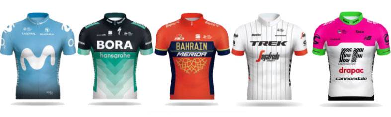
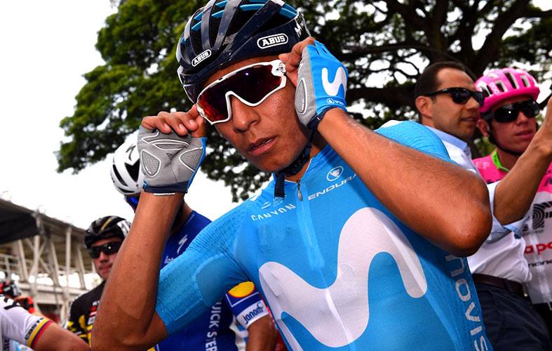
- Movistar : for me it’s a success ! this gradient of blue from lightest to darkest! Class and fresh I find this combination perfect. A unique sponsor also helps with creation and branding. Movistar bravo! 5/5
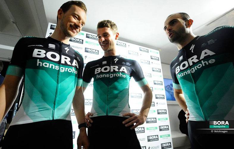
- Bora /hansgrohe : a beautiful and very graphic tunic with blue / green tendencies and triangular patterns. The color of the jersey also gives him visibility in the peloton.
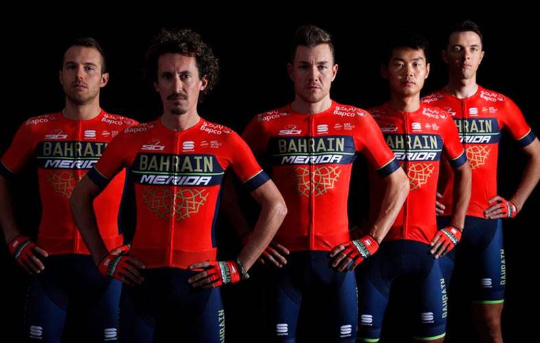
- Bahrein : a full style between midnight blue, red and gold; this jersey has a beautiful identity. I like their style and the mix of colors, I’m not a fan of red but I find their visual identity very nice. Gold is here to sublimate the whole thing. We find this color in their accessories, glasses, shoes and helmets, which allows recall colors and trends.
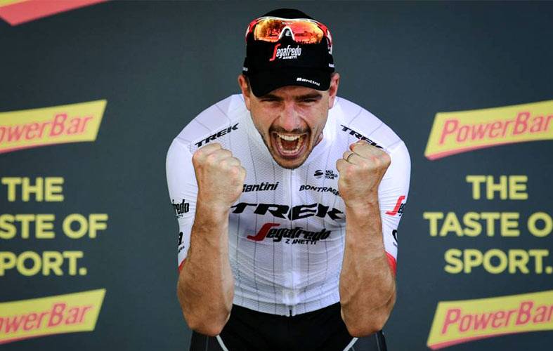
- Trek:sober, with a comeback of white in their colors jersey! Their bike also in harmony with their jersey color makes the whole thing very elegant and when they win, we even more likes their style! Bravo simple and effective.
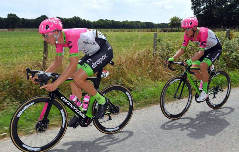
- Education First: the number 5 for Fun and because they dare too, Eduction First! they find a balance to mix the identity colors of their sponsors for an offbeat style but who has the strength to watch it is nice! I like their crazy attitude !
Finally and as always the question that we all trots in the heads:
What is the less successful jersey … !?
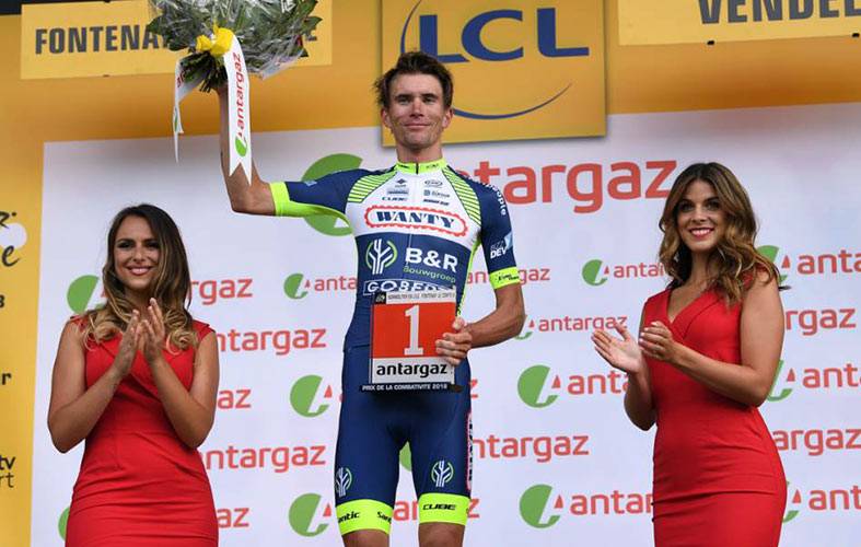
Wanty – Groupe Gobert : it’s true that with its many sponsors, it’s difficult to create a harmonious jersey.
The use of fluorescent yellow is rather interesting especially to make itself visible in the melee, but unfortunately it does not happen to be elegantly placed in the overall kit. This is reminiscent of an amateur jersey. Too bad because this team has a high sympathy and athletic potential. They lack them an identity design to be at the top of the international pack.
Nowadays, visual identity is important for visibility in the pack, from a media and advertising point of view, but also for the public. These supporters wish to proudly wear the beautiful jersey of the professional team they support.
Being stylish in the peloton gives a certain self-confidence to the cyclist who proudly wears the colors of his team and who feels respected in return by this effect of style and quality, more and more cycling brand adopts it, as same as G4.
Today All we need is a team ready to consider that style and performance are worth more than quantity and abundance. Many professional teams have contacted the company G4, to associate their brand image with our know-how between performance and elegance. Still, we are still looking for an awareness of changes in style and quality to equip a professional cycling team, a word to the wise … Don’t hesite to contact Geoffroy !!


No Comments
Leave a comment Cancel